Elements of Composition Workshop
Summary
Between September 24th-26th 2010 I attended a workshop offered by Chris Marquart. The workshop content included the basic elements of composition as well as street photography. The latter included practical advice in how to approach people as well as field trips.
Outcomes
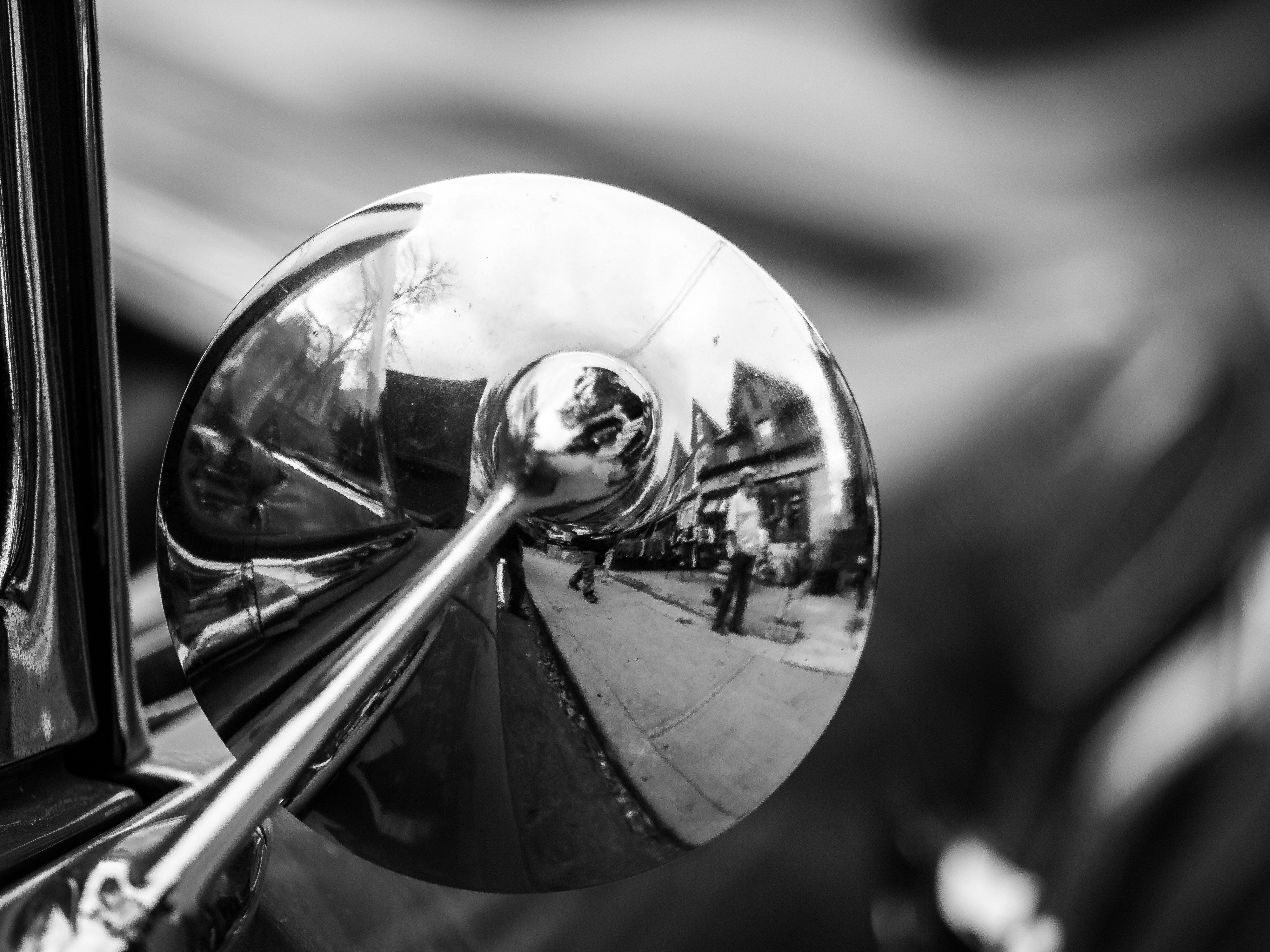
- Reflection, Angle, Human (Figure 1)
One of our assignments at TUP was to take a photograph that combined three elements: something that included a reflection, some deliberate angle and something human. Angles are covered off by the roof tops and the diagonal presented by the curb; human is covered off by the people walking through the scene and reflection is from the back of the mirror. While I took a literalist interpretation of the instructions / constraints, I enjoyed the distortion rendered through the mirror. I selected a black & white version of this photo as the colour of the background (red & green) distracted (in my mind) from the focus on the mirror which contained the three elements of the assignment.
- Angles & Repetition (Figure 2)
Alignment with the left edge of Scotia Tower along with the building in the foreground offers a rather simple structure of the picture overall; aligning the glass portion of the building in front with the top of Scotia Tower offers some sense of continuity but keeping the top of the building in the foreground misaligned offers some separation of the foreground from the background; the downward alignment of the lines of Scotia Tower juxtapose the upward alignment of the building in front. The flat, reflectionless image of Scotia Tower contrasts with the reflectiveness of the lower building in the foreground. The buildings in the reflection also have contrasting lines providing a sense of recursion or infinite repetition. The red of the tower contrasts nicely with the blue of the sky.
- Frames and Layers (Figure 3)
Contrasting the older Commerce Court North building (in front) against the newer West Building; a contrast between traditional and modern architecture styles. I used the building on the right to frame the shot, but just as an “L” frame; I tried to line up the corners of the North & West buildings as best I could. The shorter building on the left introduces a colour contrast, but one that seems to work well with the warm colours of the old North building.
- Angles and Perspective (Figure 4)
In this shot I leveraged the octagon to frame the vanishing point. I used the framing of the structure to align with the lines of the building. The octagonal plug on top was aligned with the structure of the building; the picture was cropped square. While the lines point to an end point in the sky, the plug is much closer (or covers the end point) leaving some gap. The colours attract some attention but also act to frame the vanishing point as well
Gallery


#block-24edf4fc3defd1621019 .sqs-gallery-block-grid .sqs-gallery-design-grid { margin-right: -20px; }
#block-24edf4fc3defd1621019 .sqs-gallery-block-grid .sqs-gallery-design-grid-slide .margin-wrapper { margin-right: 20px; margin-bottom: 20px; }
Blog Entries
- Tips From The Top Floor
- Angles, Perspective
- Reflection, Angle, Human
- Framing and Layers
- Angles, Repetition
- Colour: Red, Blue, Yellow
- Single Subject: Thunderbird
- Kensington Market
- TUP: Toronto Urban Photography Workshop